Living Data
Water connects us


Disclaimers, Copyrights and Citations
Presentations/Index 2010 2011 2012 2013 2014 2015 2016 2017 2018 2019 2020 2021 2022 2023 2024
 08 December 2020
Living Data: Using cultural arts practices to support evidence-based policy
Australian Freshwater Sciences Society: Water Connects Us
Living Data presents in Moree, NSW, for the 2020 AFSS (Australian Freshwater Sciences Society) conference, 'Water Connects Us". Lisa Roberts and Ellery Johnson present results from the MEASO Living Datainitiative where the arts contribute to understanding scientific data, thereby increasing their value as fundamental to accurate, long-lived communications and robust decisions.

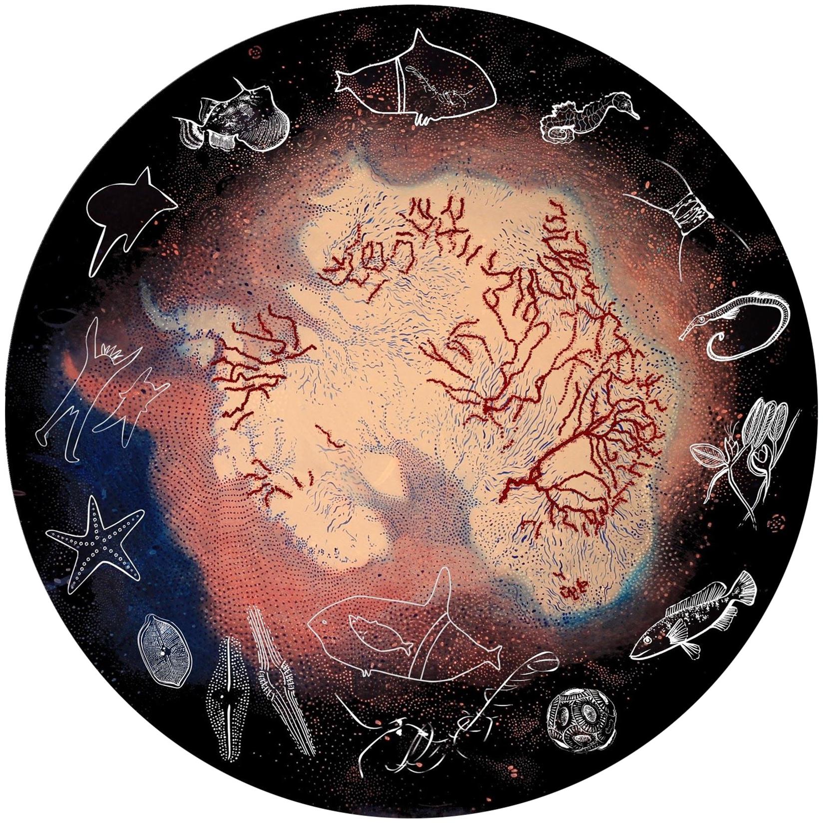
MEASO Living Data infographic
Design: Lisa Roberts and Katherina Petrou
MEASO is the Marine Ecosystem Assessment for the Southern Ocean.
Living Data are scientific data and Indigenous cultural knowledge systems combined through languages of art.
This presentation comes from interactions between scholars around the world whose different disciplines and cultures contribute to a movement towards an inclusive and holistic world view: Lisa Roberts, Ellery Johnson, Paul Fletcher, Cat Kutay, Tracey Benson, Jessica Melbourne-Thomas, Katherina Petrou, Melissa Silk, Stephen Taberner, Victor Vargas Filgueira, Andrew Constable, Danae Fiore
TRANSCRIPT
Introduction:
Hello everyone. Firstly I acknowledge the traditional custodians of this land on which we meet,
and pay my respects to Elders, past, present and future.
I acknowledge the support of UTS for my contribution to this conference.
I'm a visual artist and interactive author; I interact with scientists, artists and other scholars, to co-author stories that come from scientific data and Indigenous cultural knowledge. Like many Australians with European and Aboriginal Australian ancestry, I am dispossessed of knowledge of my traditional lands and languages, and I strive to reconnect the different ways of knowing that together sustained Aboriginal Australia for tens of thousands of years. Since working as an artist in Antarctica I recognise Antarctic krill (Euphausia superba) as my totem. As I strive to understand this keystone creature I learn about the Southern Ocean as the ecosystem that drives natural cycles of climate change worldwide. So, my perspectives are Antarctic, Australian, Indigenous and global.
Today I present with UTS scientist Ellery Johnson. We show how we work with people around the world to combine our perspectives to build an animated interactive map, to reconnect science and art with Indigenous cultural knowledge that has for too long been missing from reports to the International Panel of Climate Change (IPCC) .
I begin by explaining the background, methods and results of our work to map and identify stories as ways of knowing described by Indigenous scholar Tyson Yunkaporta, as minds that work together to create a holistic view. We show ways of telling stories that expand understanding of scientific data, thereby expanding the sources of knowledge as fundamental to accurate, long-lived communications and robust decisions.
One such story is told by Ellery's drawings in sand. Drawings in sand bring to life his knowledge from scientific data, of disruptions to natural flows in an estuarine environment, where a river meets the sea.
We conclude with a Discussion, Summary, and an Invitation to meet with us to make a time to animate your science story for the Living Data map.
Background:
Scientific data and Indigenous cultural knowledges indicate that all lands and waterways are connected. In line with the strong movement towards recognising place-based knowledge and connection to country, and the central role of the Southern Ocean in regulating global ecosystems, we are collecting stories along the path of the ocean currents from Antarctica to all other areas, to express the significance of the linkages around the world, of the effect of climate change.
Ancient and new technologies are explored to understand connectivity in natural systems, with stories informed by Indigenous knowledge and the scientific method.
Methods:
Our Methods build on the success of the 2018 Lens on Health Round table table event for National Science Week at UTS. Guided by Wiradjuri scholar Megan Williams, everyone was welcomed, introduced and engaged as we told our stories of relationship to Aboriginal Australia. We then engaged through the arts with the science of connectivity in nature.
Everyone had something to teach and something to learn.
In 2020, co-authors of this paper met for round table discussions via Zoom. Facilitated by Antarctic scientist Andrew Constable, we came from different countries and disciplines to co-author a paper that would engage policy makers in the scientific data of Southern Ocean health, through a range of perspectives.
Acknowledging that people think in different ways, stories are collected, composed and identified according to ways of knowing described by Tyson Yunkaporta (2019) as minds that work together to give a holistic view: kinship-mind, story-mind, dreaming-mind, ancestor-mind and pattern-mind. And, to enable active ways to engage with the stories online, Creature avatars are being created for people to play with and imagine themselves being part of the stories told:
Between us we wrote and prepared material to seed the evolving online MEASO Living Data map, and this link was embedded in the paper: https://measocc.teachingforchange.edu.au/
Animations were made that trace scientific data, and drawings and gestures that people make as they tell their stories. Music and poetry were made in response, and fed back into the project. The paper, with online component, was written as an invitation to experience stories told on virtual country, and to relate these stories to their own knowledge and experience of relationship. The paper is currently under peer review for publication.
Results:
The MEASO Living Data animated interactive map was begun as the key component of a series of publications and presentations to contribute to IPCC reports and mainstream media, in the lead-up to the 2022 global stocktake, when countries worldwide are due to announce how they measure up to the 2015 Paris Climate Targets.
We suspect the arts will have a vital role to play in conveying the scientific data at this time.
IT engineer Cat Cutay has begun to develop the map and online portals for collecting and displaying stories, and enabling people to feed back into the ptoject, to share and grow knowledge:
https://measocc.teachingforchange.edu.au/
I have begun to develop the Living Data Library as a repository for feeding into the map, and for presenting as a touch-screen interactive and online: https://lunartime.net.au
The Living Data Library and online map were first presented at the conference, 'Listening in the Anthropocene', hosted by Charles Sturt University in Wagga.
I now present stories from the map, and then Ellery will draw his story in sand to bring to life his scientific data, of disruptions to natural flows in an estuarine environment.
Living Data animations
Ellery drawing in sand
Discussion, Summary:
Animations are co-created and geo-located to enable people to physically and viscerally connect with regions other than those they inhabit, and increase awareness of global values and issues, from different sources of knowledge.
Stories continue to be collected along the path of the ocean currents from Antarctica to all other areas to express the significance of the linkages around the world, of the effect of climate change.
Traditional and contemporary cultural arts can show connectivity in nature, in ways that bring to life data from the scientific method, and reveal how Indigenous knowledge and Western science can be complimentary, and show the difference between historical, natural, environmental phenomena and current changes and disruptions to existing ecosystems.
Questions from conference delegates